Usersnap brand guidelines
Usersnap is customer feedback software for SaaS companies, built to help them get customer validation quickly and make confident product decisions. Its brand guidelines put one idea, make feedback matter, behind everything the company writes and designs.
Version 1, August 2021, covers positioning, tone of voice, the logo, typography, colour, icons and illustration: one reference for the website, the product, the blog and marketing materials.
Make feedback matter
Usersnap empowers SaaS companies to be feedback-driven and build customer-centric products. Teams screen-capture issues with annotations directly in their product, run mini-surveys with ratings and custom questions during specific customer journeys, and take the insights, with customer details and technical context attached, to fix and discuss user stories.
Who is Usersnap?
We are the people who make feedback matter. We believe feedback-driven companies provide the best products to people. We put customers and their stories first: we listen, learn, improve, evaluate and we enable our customers to do the same.
Cheerful, quirky, impactful, sincere
Four traits, each drawn as a character and each tested against a real line of product copy. Whatever you are writing, make it sound like something you’d say to a close friend who needs good advice for their startup.
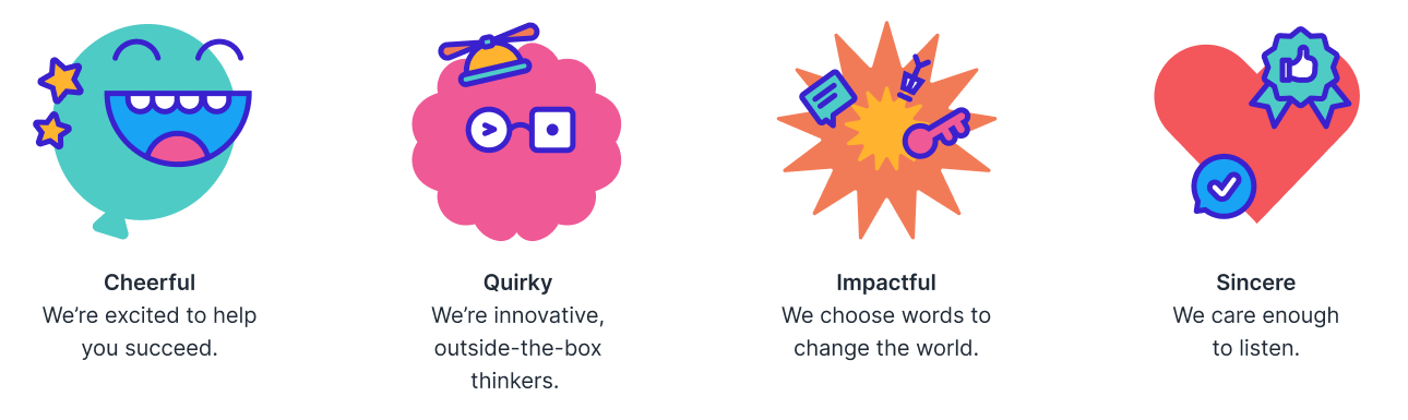
CheerfulWe’re excited to help you succeed
Throughout everything we do, including writing, there is a deep-seated optimism. We exist to solve problems. We don’t ignore what’s wrong, we focus on making it right.
Time flies! Your 15-day trial may be over, but our relationship is just beginning.
Your 15-days free trial has ended. Subscribe now to continue.
QuirkyInnovative, outside-the-box thinkers
The people who change things are always a little different. A no-BS mentality: the idea is not to write jokes, it’s to hack through the fluff to get the job done.
Collecting feedback is a game-changer. Subscribe today and get 3 months free.
User feedback in digital businesses is essential. Subscribe today to get 25% off discount in your first year!
ImpactfulWe choose words to change the world
We’re not here to recycle buzzwords. We know the way forward and we never sugarcoat things. We get to the heart of the problem and solve it.
Usersnap lets the whole team know what users are saying, so you can build great products.
Usersnap is the perfect platform for teams developing digital products and web experiences.
SincereWe care enough to listen
More than anything, our technology is a system for active listening. We’re polite but real. We don’t pay people lip service.
A developer is assigned to your issue now. You’ll hear from us in a day or two.
We will look into your issue.
Most importantlyStand out
Do not write like a corporate drone. Write impactfully, with cheer, quirk and sincerity, like a human.
An existing logo, refined
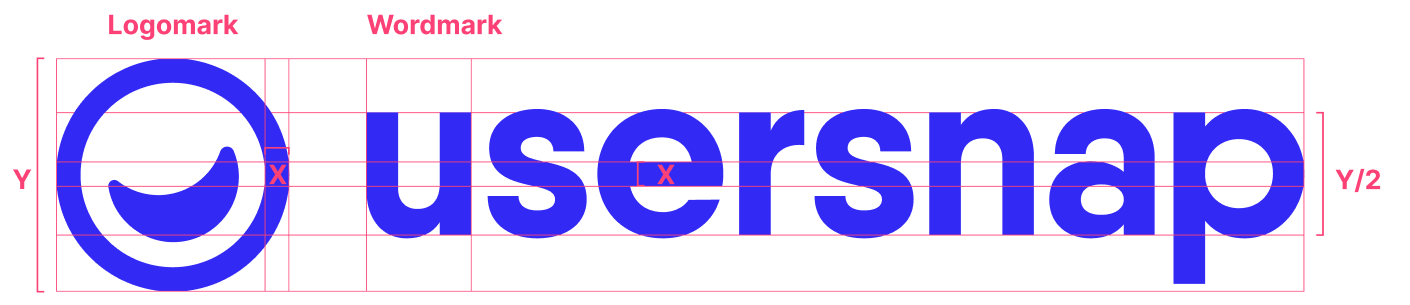
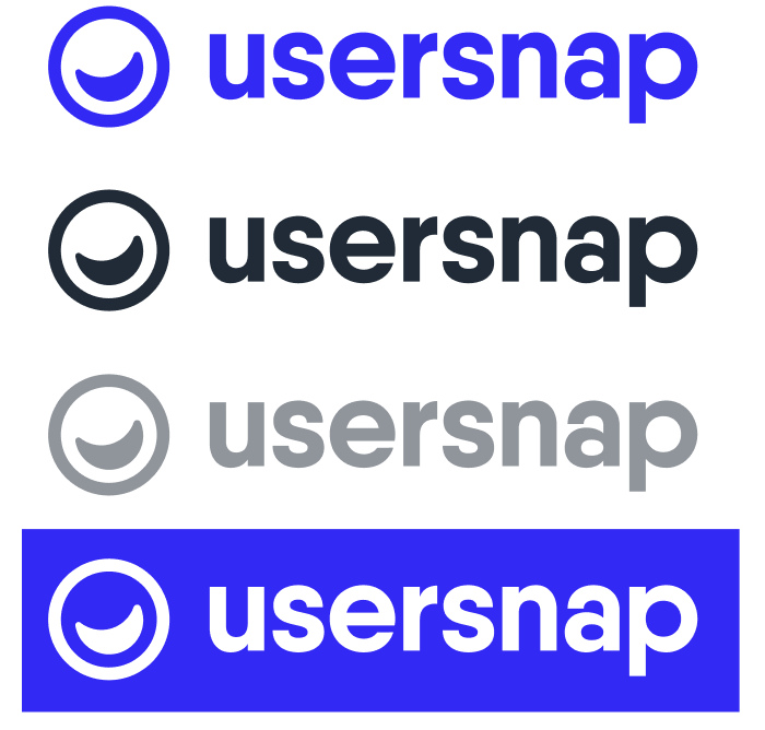
The Usersnap logo is not a Studio Ross design: the company already had it. The work here was refining it and fixing its proportions as a system: the mark’s height sets the wordmark, the wordmark’s x-height is half the mark, and the gap between them is fixed.
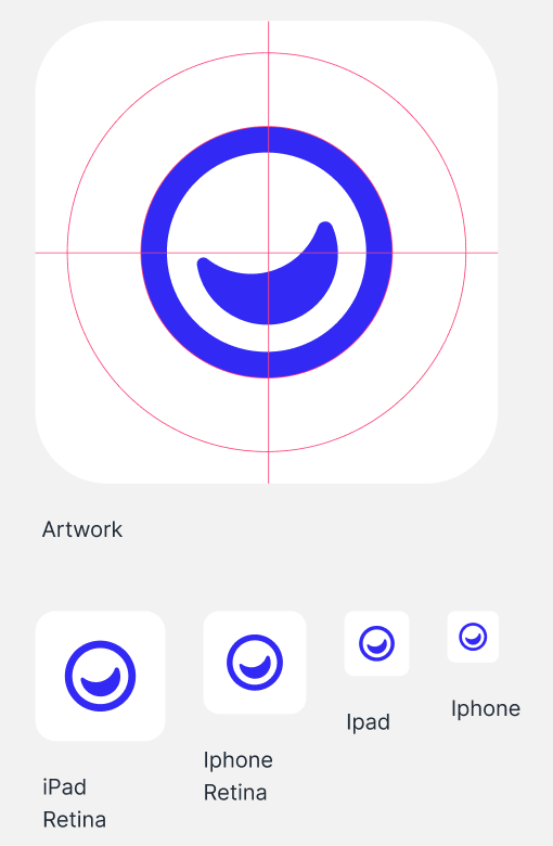
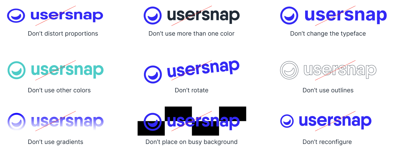
The logomark represents a happy user, Usersnap’s promise to its customers. The refined logo holds up at large and small sizes and comes in four colour variations: primary blue, primary black, opacities of primary black, and white on blue. The same mark becomes the app icon, centred on a white tile at every device size.

One headline face, one working face
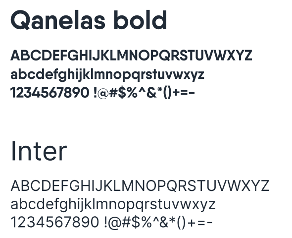
On the website, Qanelas is the headline font, used in one weight only: bold. Inter carries body text and every headline from H3 down, in four weights: regular, medium, semi-bold and bold. The product runs on Inter alone, with Courier reserved for components that show code snippets.
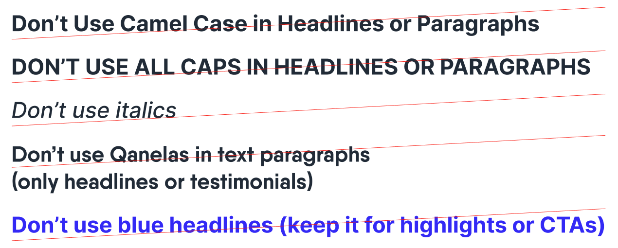
The rules are short. No camel case and no all caps in headlines or paragraphs. No italics. No Qanelas in running text, only headlines and testimonials. And no blue headlines: the blue is kept for highlights and calls to action.
One blue, used sparingly
The primary palette covers most everyday needs on the website and in the product, and it is intentionally small so as not to dilute the brand. The blue highlights things, calls to action and links. Everything else is black text on plenty of grey and white space.
The secondary colours are hardly used in the product. They are there for the website, the blog illustrations and marketing materials, and every avatar background is one flat, distinctive colour from them.
Usage: 5% blue, 15% black, 30% grey, 50% white.
One line library, adjusted where needed
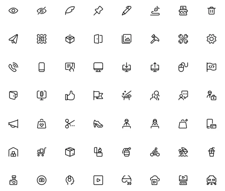
Most product and website icons come from the Streamline icon library. When needed, they are adjusted in line weight, colour or content to fit Usersnap’s specific needs.
Three languages, one palette
BlogPlayful
Simple, icon-based compositions that accompany article headlines: flat colour surfaces and blue outlined iconography in one stroke weight. A different graphic language from the website’s on purpose.
WebsiteProfessional
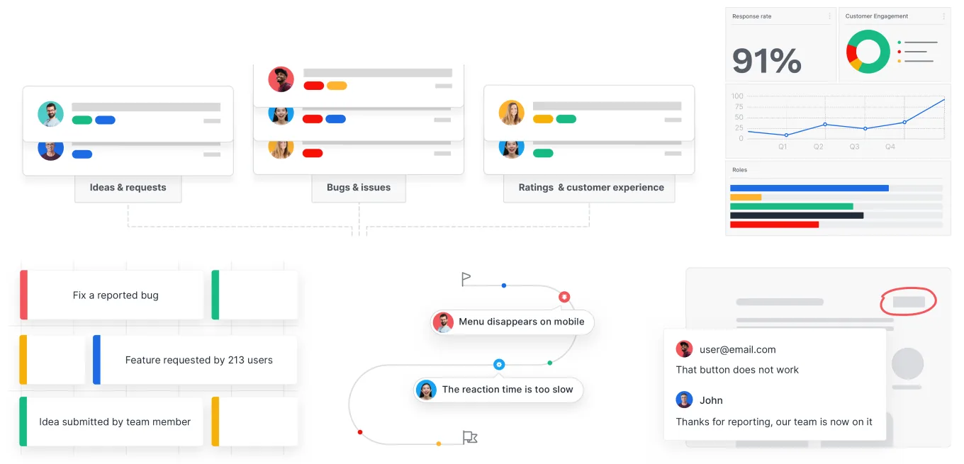
Concise and simple fragments of the product, ideas and requests, bugs and issues, ratings, so visitors can scan a page and understand its content at a glance. Custom avatars put the customer, the real subject, in every scene.
ProductHumane
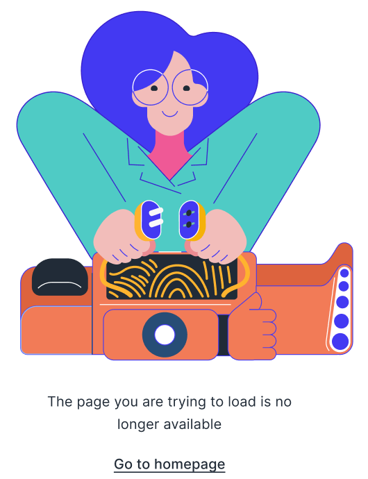
Used scarcely and paired with messages such as a 404: humoristic, humane characters with blue outlines in the primary and secondary palette, adapted from Craftwork’s illustration bank to fit the brand colours.