Lens Flashman
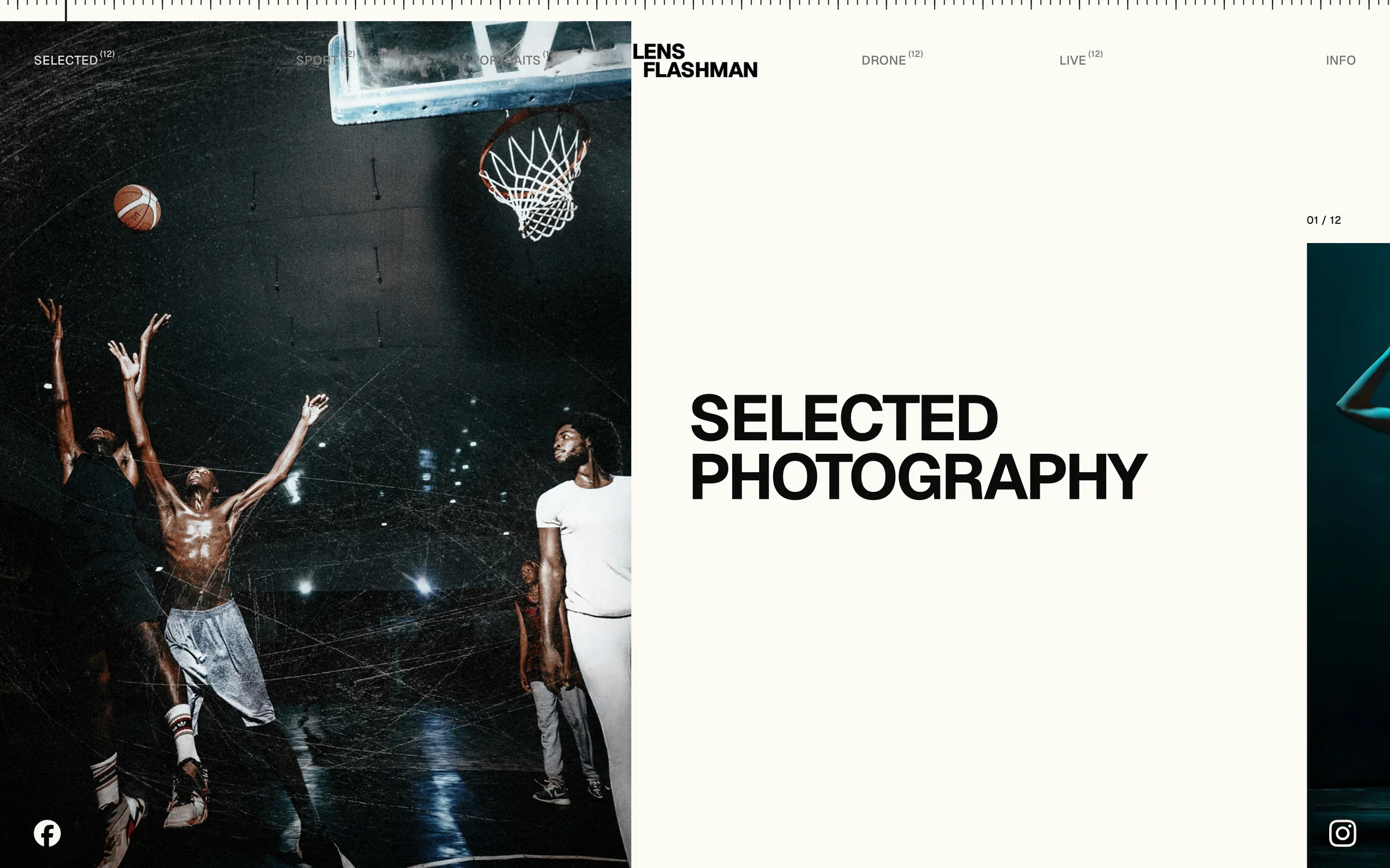
Lens Flashman is a Framer website template for photographers. The whole portfolio is one long horizontal track: every category opens on a full-height cover and runs into a staggered gallery, like walking along an exhibition wall. I designed it and built it in Framer, including the code components behind its interactions.
The problem
Most photography templates are grids. A grid is efficient, but it flattens an edit: every frame gets the same size and the same weight, and the sequence a photographer worked hard on turns into a wall of thumbnails.
The template grew out of a portfolio site I designed for a working photographer. The goal was to keep what made that site feel like a show rather than an archive, and make it something any photographer can fill with their own work, without touching the layout.
Role & build
I designed the template and built it in Framer end to end: layout and type, the CMS model, the three breakpoints, and the custom React code components that handle the scrolling, the ruler, the cursor and the lightbox.
The sample content is deliberately neutral: a placeholder wordmark, sample copy and commercially licensed stock photography, so a buyer starts from a clean file and nothing in it belongs to a real client.
The mouse wheel scrolls the page sideways. Frames change height and sit high or low on a fixed rhythm, with a counter under each one, so the eye keeps moving the way it does in a gallery. Wide frames are capped so a landscape never swallows the screen.
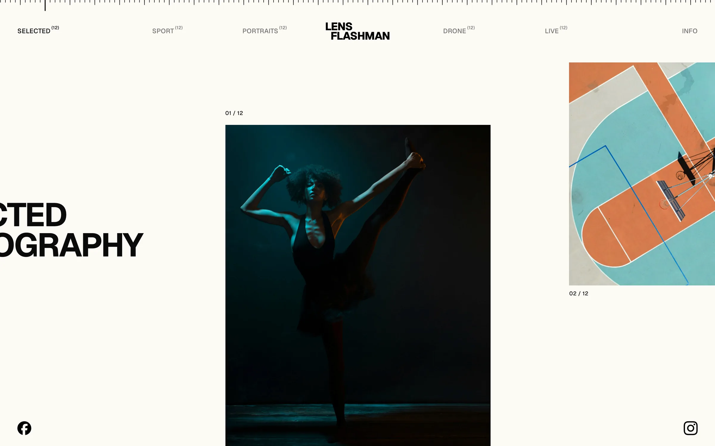
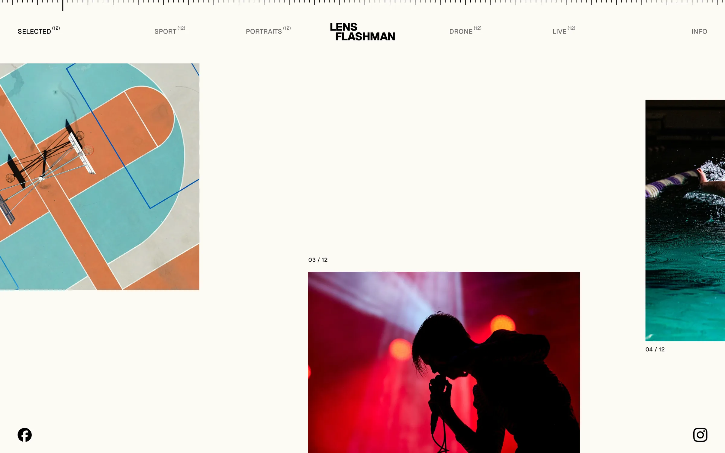
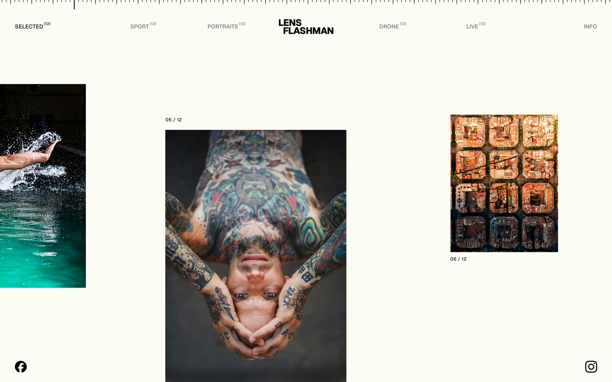
Framer's built-in components could not do what the design needed, so the interactions are custom code components, each exposed to the buyer as a simple property panel.
- 01Wheel to sideways
Vertical scrolling drives the horizontal track, so it works with any mouse or trackpad and needs no instructions.
- 02A ruler that reads the scroll
A band of ticks along the top edge. One long tick travels between the menu items and reaches the next one as its category takes over the screen.
- 03Navigation over any photo
The menu and social icons use a difference blend, so they stay legible over dark covers and the paper white alike.
- 04View, Prev, Next
The cursor itself says what a click will do. Clicking opens a full-screen viewer that steps through the category.
- 05Menu built from content
Menu links and the photo counts beside them are generated from the categories, so adding one never means editing the navigation.
- 06One page for contact
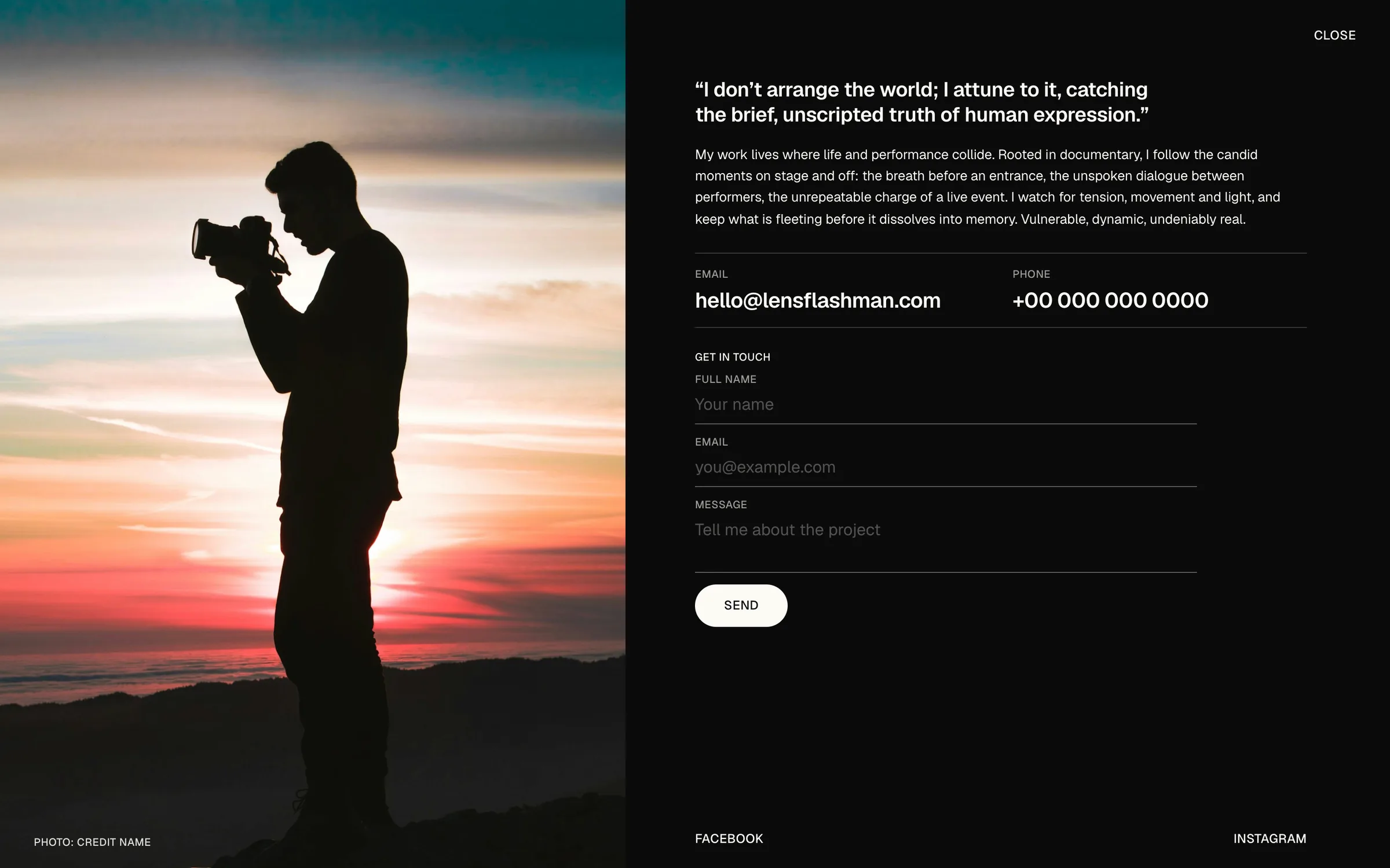
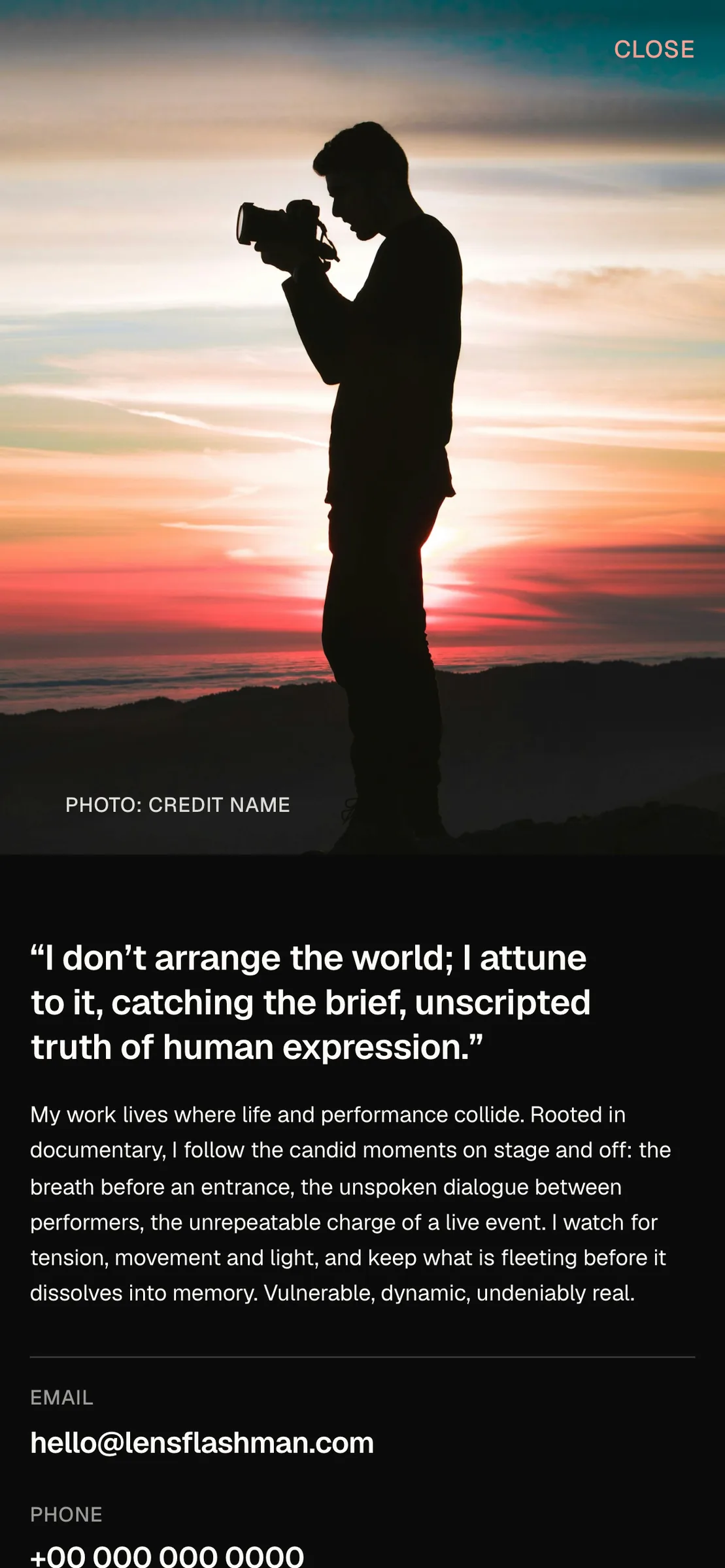
A dark Info page: portrait, statement, email and phone, and a working Framer form, all within one screen from 1280×720 up.
Built for the buyer
Every category is one CMS item: a name, a title, a cover and a list of photos. Adding a new body of work is a new entry, and the cover, the title, the gallery rhythm, the counters, the menu link and the ruler all follow from it.
Decisions and tradeoffs
The rhythm of frame sizes is fixed rather than editable. Photographers get a layout that always looks composed, at the cost of placing each frame by hand. A "Start here" page inside the file walks buyers through the CMS, the components and the breakpoints.
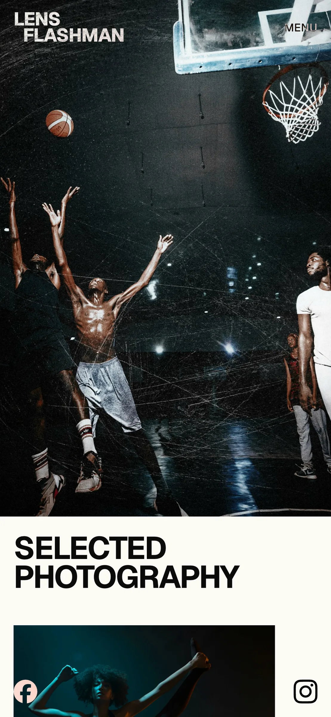
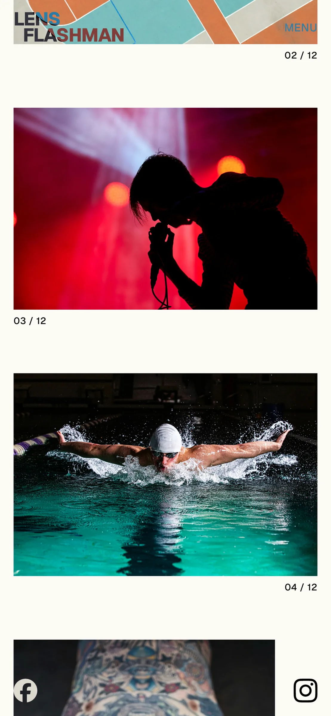
Below tablet width the track turns into a vertical stack: cover, title, then the gallery frames one under another, with a menu in place of the full navigation.
Lens Flashman is new, so there are no sales or usage numbers to report yet. The template is complete across desktop, tablet and phone, and the live preview runs on Framer's own hosting.
For me it is also a proof of practice: a design made for one photographer turned into a product for many, with the design and the code components made by the same hands.
Open the live preview