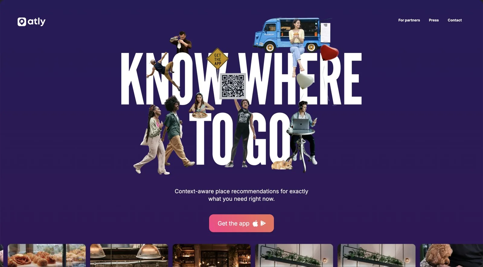
Atly needed a brand that made its case before a single feature got explained. The work runs from the pin-and-bubble symbol through colour, type and a collage language, and it lands on one idea: curation should feel like the opposite of a crowded map. The guidelines exist so the system keeps holding once other people are running it.
Atly curates places around taste and whatever the moment calls for. It scores the features of individual places across trusted sources instead of ranking by popularity, so a search returns a fit rather than a crowd.
Most discovery platforms run on popularity: trending, highly rated, widely visited. That gives you crowded maps, inflated reviews and recommendations built for everyone in general and nobody in particular. The identity had to take the other side of that argument, and do it on first impression.


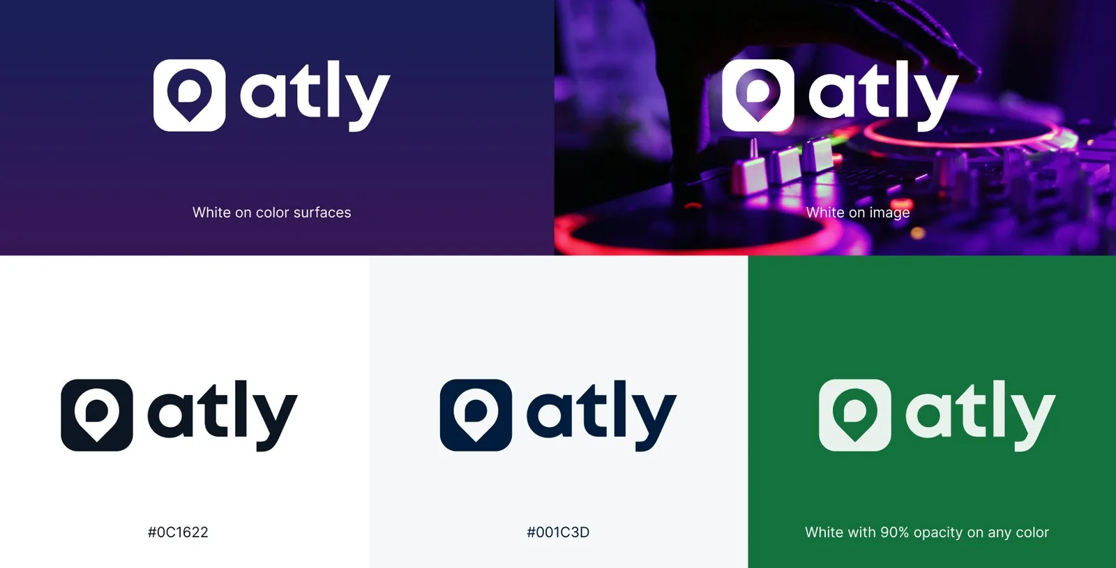
Two shapes, rotated and merged: a map pin for the place, a chat bubble for the buzz around it. They resolve into a single mark that carries both. Hover to see the construction.
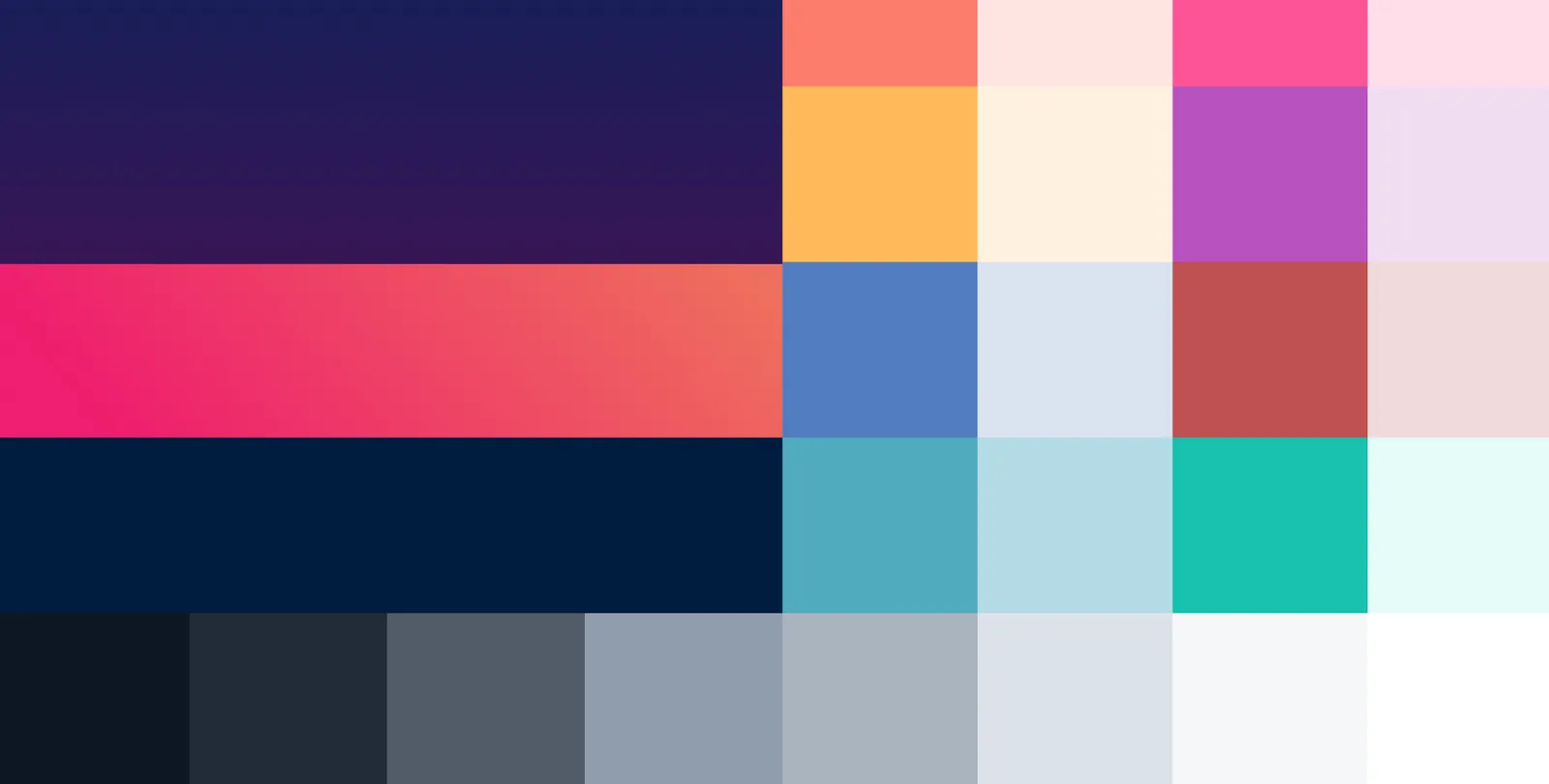
League Gothic takes the headlines. It is condensed and loud, which is what the big-type compositions need. Inter carries everything else in four weights, shared with the product design system so brand and interface stay in step.
Real, unstyled, people first. Crowded tables, kitchens, streets, dogs. This is raw material for the collages, so every frame has to survive being cut up and still read.

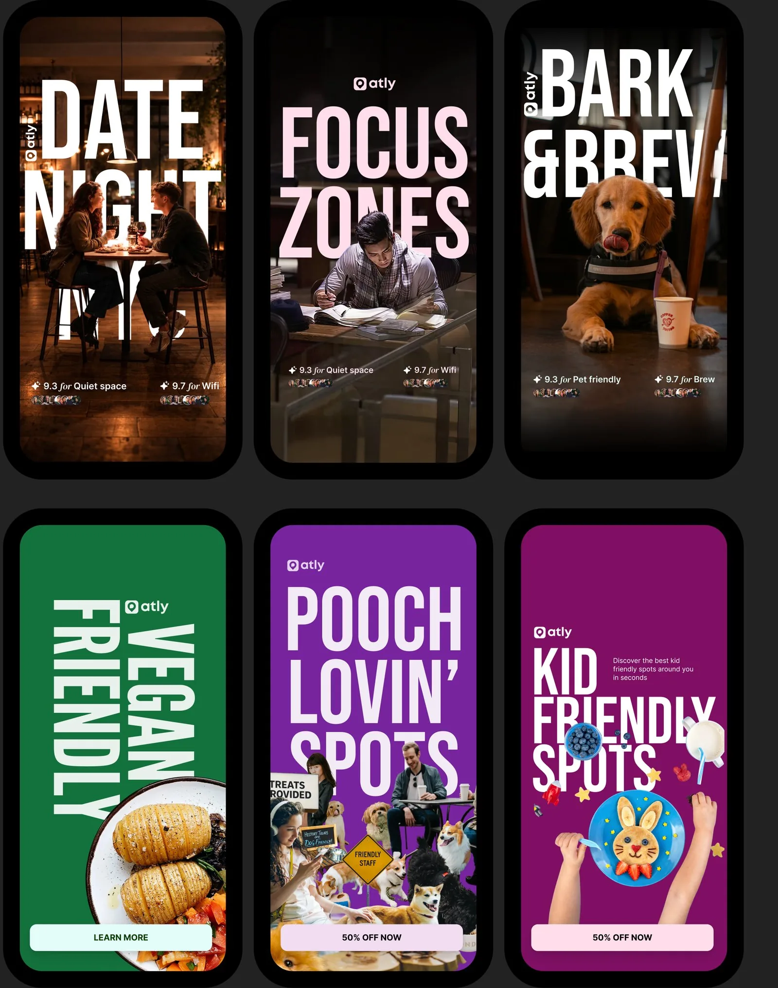
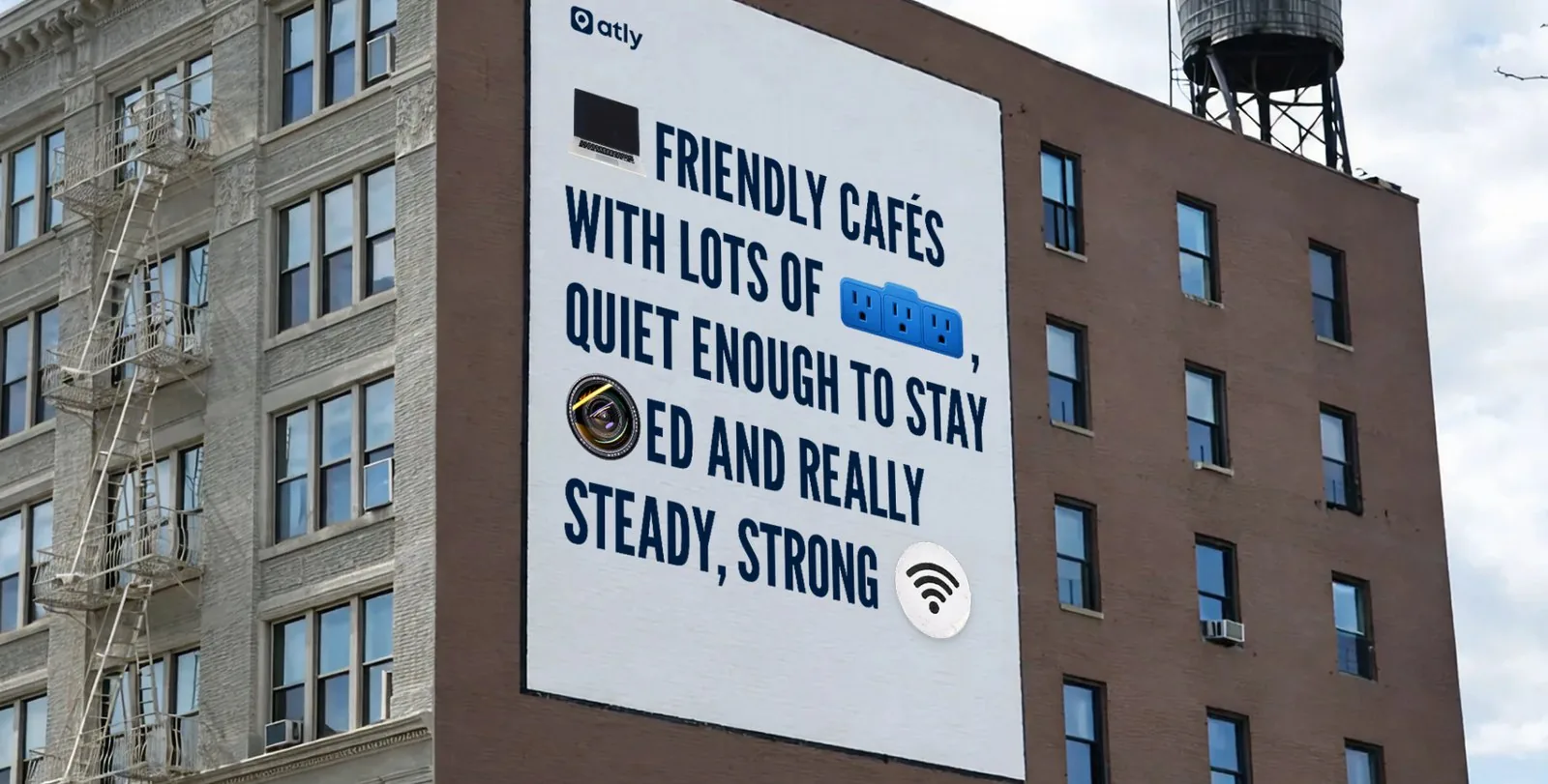
Nobody goes looking for a mapping app. They go looking for a work-friendly café, somewhere that can handle a four year old, a place the dog is welcome too. Each campaign takes one of those intents and speaks only to that, so the ad lands as an answer instead of an advert.
Leading with a subject someone already cares about buys the first tap. Behind each one sits the same product and the same map, filtered to the sector in the headline. Prove the map on the thing they came for and subscribing stops being a pitch, it becomes the obvious next step.
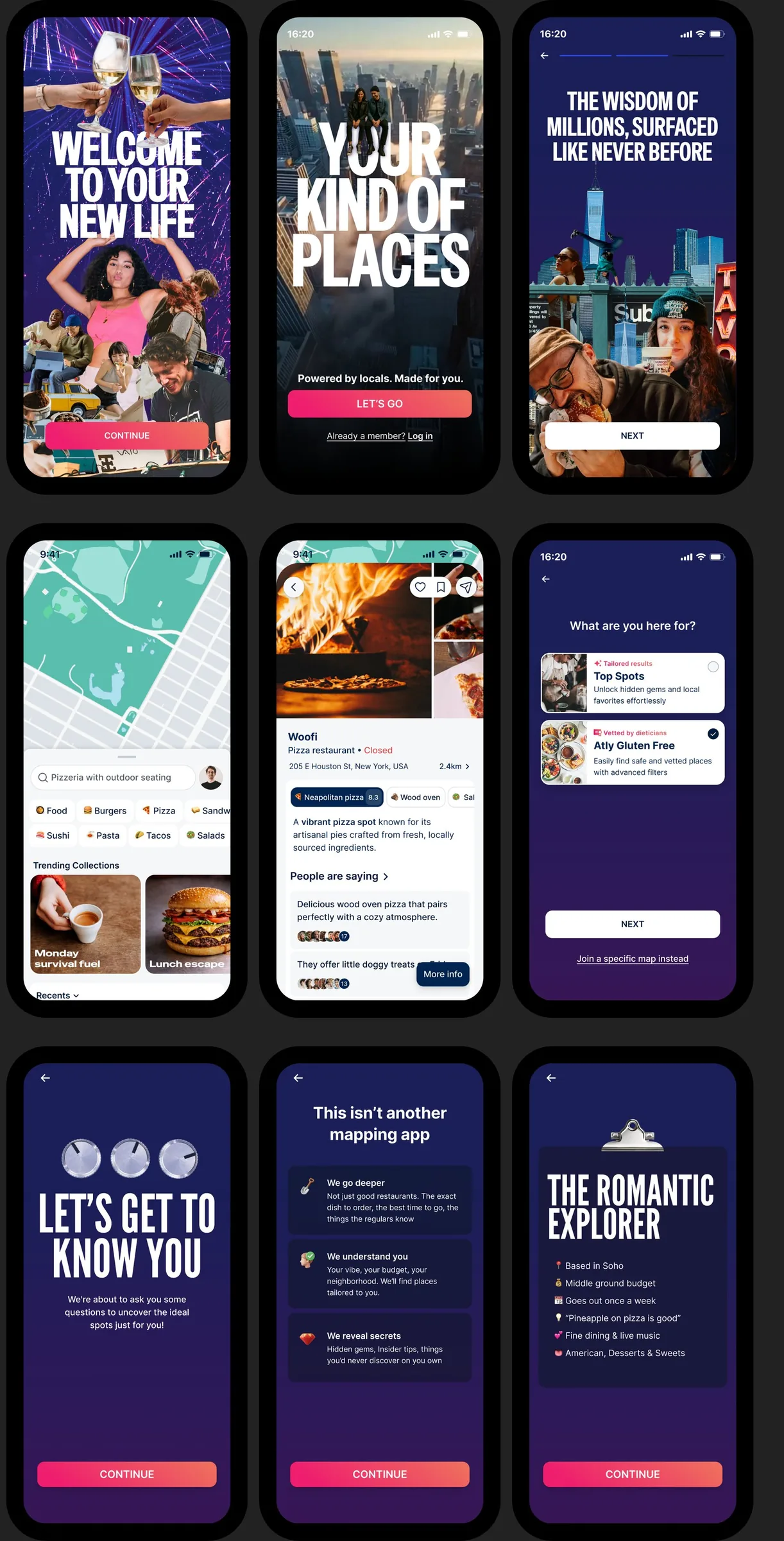
The brand does its loudest work at onboarding, then gets out of the way. Once someone is inside the map, the neutrals and Inter take over and the results stay legible. Knowing when to stop is part of the system.
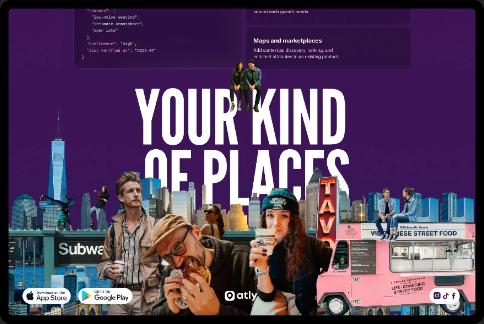
Shipped in 2026. It now runs across the app, the marketing site, the app icon, sector campaigns and out-of-home.
One of three pieces of Atly work here. The pivot redesign came first and the guidelines came out of it, which is why product, identity and the web presence pull in the same direction instead of being reconciled after the fact.