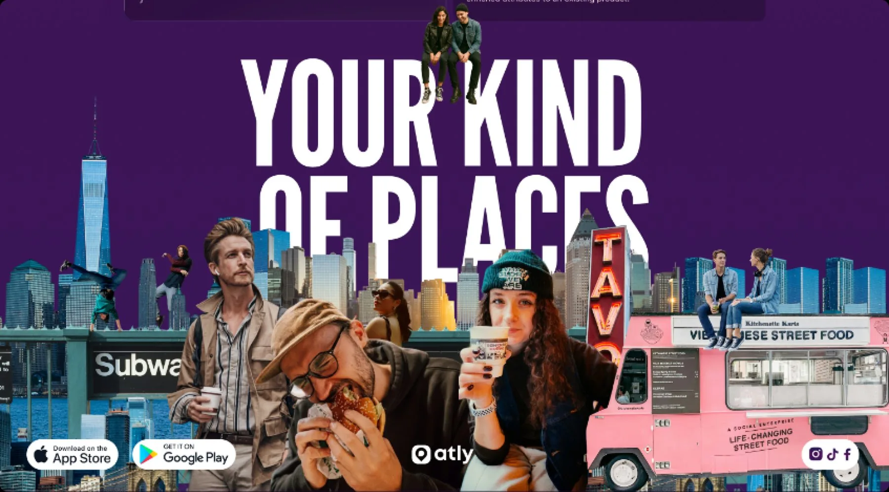
Atly website
Atly.com is repositioning from a consumer discovery app to a place-intelligence platform with a partner API. One page had to carry both. Scope ran end to end: positioning, brand expression, UX, copy, and the production front end.
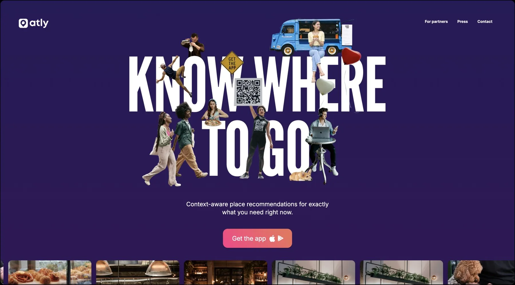
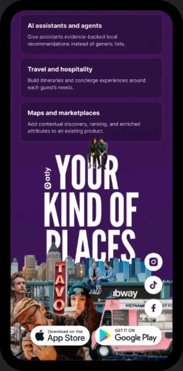
Atly’s brand expression mirrors the way the product thinks: it brings many fragmented signals together into one clear, personal answer. The collage system combines cut-out people, food, places and everyday urban moments, giving the brand a raw, editorial NYC energy while grounding it in real places, real people and individual taste. Against that human, imperfect imagery, crisp typography, vivid tech-forward colors and a structured interface introduce a layer of intelligence and precision, reflecting the AI and data system underneath. The result feels less like a conventional map or tech utility and more like a smart cultural guide: personal, fast, local and highly specific.
Goal
Land a new positioning, context-aware place recommendations, and open a second audience of developers evaluating the Atly Intelligence API. One site, not two.
Constraint
The proposition is abstract. It has to register in seconds for a consumer and still hold a technical reader long enough to act. One narrative, two conversions.
Places, not utility
Mapping products look like infrastructure. Atly sells judgment about places, so the brand had to read as human and particular. Oversized condensed display type carries the structure. Photographic collage of real people in real places keeps the subject physical. A deep aubergine field holds it, with a single warm coral reserved for action.
One system, reused
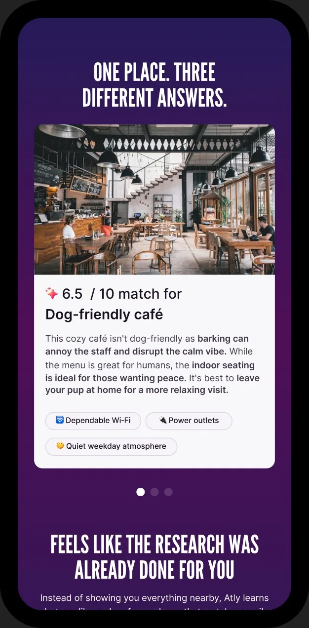
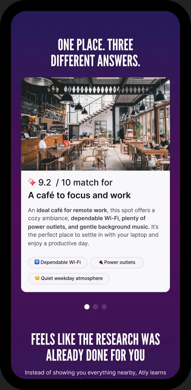
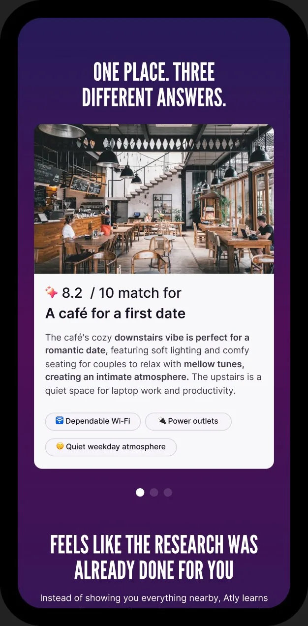
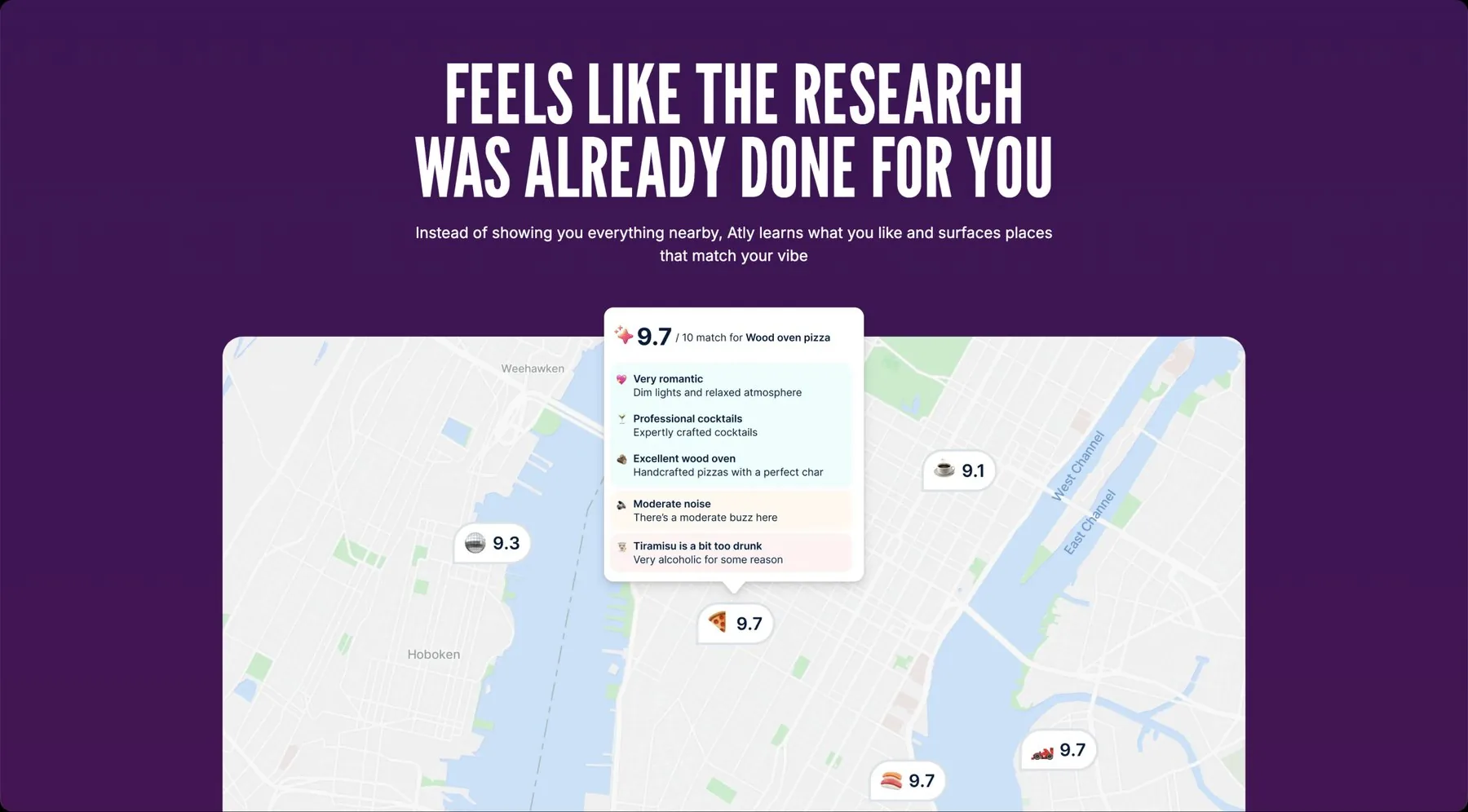
The engagement set the type scale, the collage treatment, and one signature component: the scoring card, a match score out of ten with its evidence underneath, negatives included. It is the app’s core UI, the site’s proof, and the shape of the API response. One language on every surface.
Structure and decisions
One page, two arcs, one hingeStructure
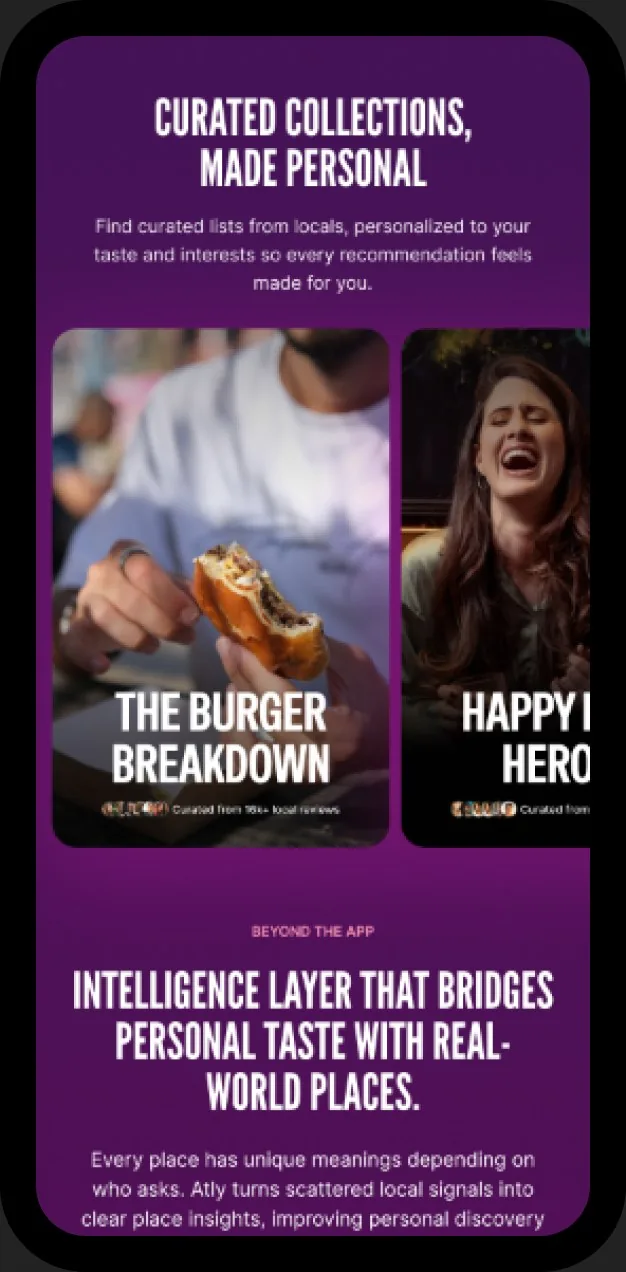
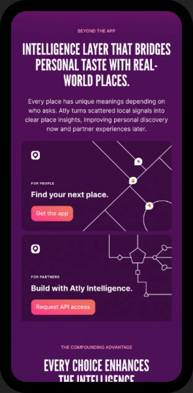
The scroll runs two arcs. The consumer arc moves through hero, intent demo, map recommendations, and curated collections. One section, “Beyond the app,” hinges to the platform arc: the data flywheel and the Atly Intelligence API. Two calls to action sit side by side, Get the app and Request API access, so neither audience reads as an afterthought.
Lead with the mechanicDecision
The first interaction is a demo, not a feature list. One café, three intents: focus and work, dog-friendly, first date. Score and evidence shift with the intent. It teaches the premise, that people search with an intent rather than for a place, before the page asks for a download.
Speak the product’s languageConsistency
The site uses the product’s own components instead of a separate campaign style. The scoring card appears verbatim, then returns in the API section as an illustrative JSON payload. The consumer promise and the developer contract are visibly the same idea.
Design and build as one jobProcess
Built as it was designed. Type scale, spacing, and collage compositing were resolved in the browser at real breakpoints rather than approximated in a static file. Mobile is a deliberate reflow, not a shrink: display type, demo, and both calls to action hold in a single column.