Atly onboarding
Most people met Atly through an ad, and every ad spoke to one interest: work-friendly cafés, pet-friendly places, spots for kids and families. The onboarding picked up exactly where the ad left off. It gave each user what they came for first, then showed that the app covers far more than that, so the subscription bought more than the ad had promised.
Ten paywall variations were A/B tested and the winner lifted conversion by 124%. Matching the onboarding and paywall to the campaign that brought each user in lifted it by a further 53%.
Give them what the ad promised, then show them everything else
One ad, one interestCampaign
The marketing campaigns targeted specific interests rather than “places” in general: work-friendly cafés, pet-friendly spots, places suitable for kids and families, and more. Each ad made one promise to one kind of user.
An onboarding built for that interestExpectation
Before, every user landed in the same generic flow, whatever ad they had tapped. Now a user arriving from the work-friendly ad sees work-friendly examples: the café scored for working, the pin scored for a laptop. Even the paywall’s photography follows the campaign: people working on laptops for the work-friendly ads, dogs in cafés for the pet-friendly ones, nights out and food for the general campaign. The first thing the app does is keep the ad’s promise. The screens on this page show the work-friendly version.
Then a promise of much moreWidening
Once the expectation is met, the flow widens the frame: the same scoring works for any kind of place and any plan, from a night out to a gluten-free dinner. The user came for one answer and leaves knowing the app covers far more than they expected.
An easier yesResult
Getting what you expected first, and then more, makes the subscription psychologically easier: it no longer pays for a single use, it pays for every next one. Matching the onboarding and paywall to the campaign behind each user lifted conversion by 53%, on top of the 124% from the paywall tests.

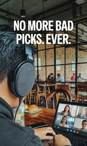

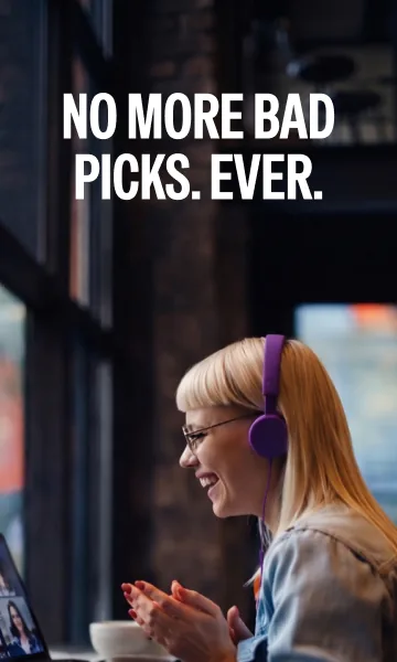



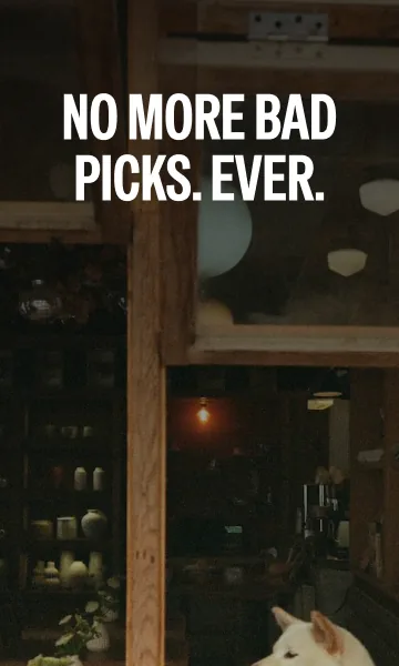

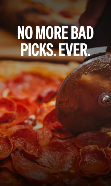

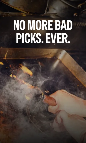
The paywall’s headline stays the same. The photography changes with the campaign that brought the user in.
Say what Atly is, then ask what you came for
The first screen carries the positioning in four words, your kind of places, with the promise underneath: taste-fit places, ranked for every craving. Logging in is one tap away for returning members, and everyone else gets a single button.
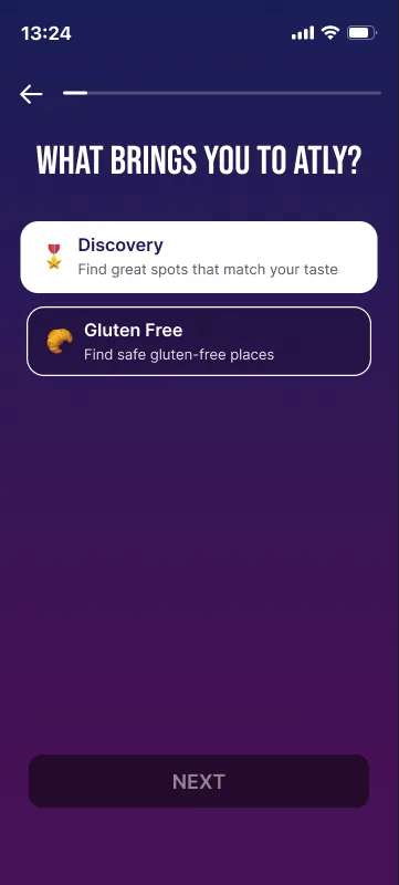
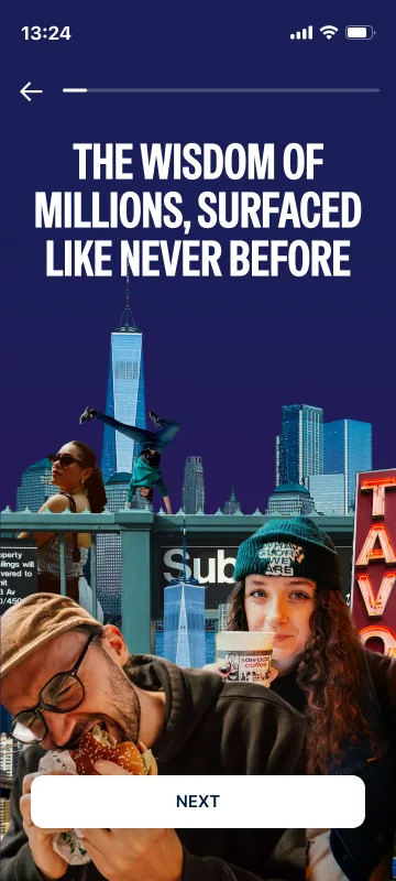
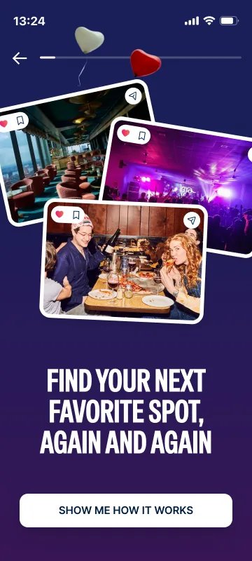
The second screen asks one question, what brings you to Atly, with two answers: discovery, great spots that match your taste, or safe gluten-free places. From here the flow knows which promise to keep. The next two screens state it plainly: the wisdom of millions, surfaced, so you find your next favourite spot again and again. The button there reads Show me how it works, so the story that follows is something the user asked for.

Show the score before asking for a cent
Start from the painStory
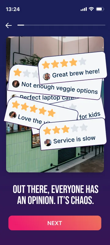
Out there, everyone has an opinion, and it’s chaos. The screen shows it literally: one café buried under contradictory star ratings, from “great brew here” to “service is slow.” Everyone has been in that scroll.
Then the product’s own answerMechanic
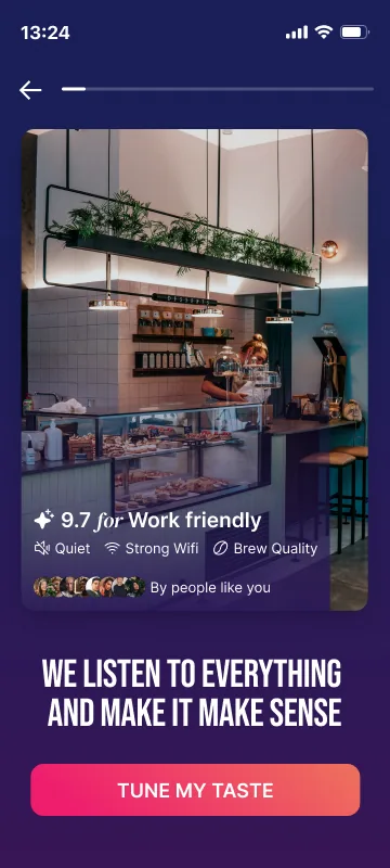
The same café, resolved: 9.7 for Work friendly, with the evidence underneath (quiet, strong wifi, brew quality) and the faces of the people like you it came from. It is the match score from the app, used as the onboarding’s proof rather than described in a caption. The button under it reads Tune my taste: the user is already personalising.
Land it on the mapReveal
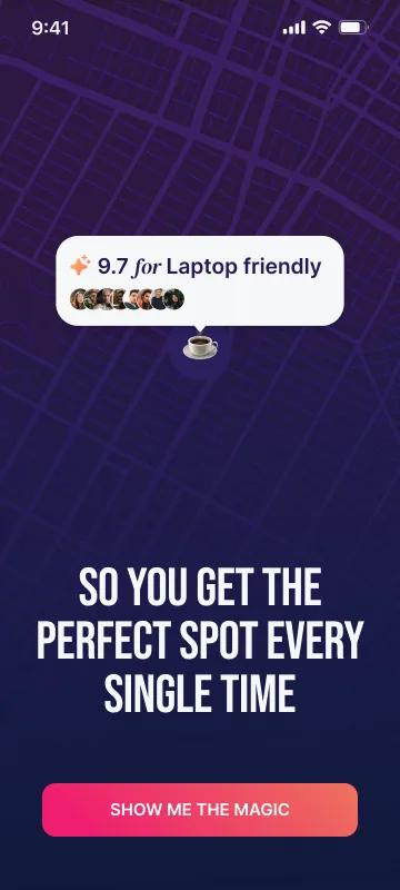
The last story screen drops a 9.7 Laptop friendly pin on a city map: so you get the perfect spot every single time. The button says Show me the magic, not Next. The user is asking to see the product before the paywall appears.
Ten variations, one winner
Tested, not arguedExperiment
Ten paywall variations ran as A/B tests. The winning version increased conversion by 124%.
What the winner saysAnatomy
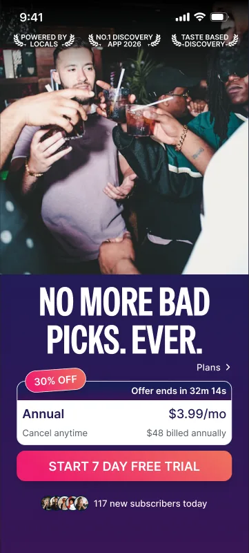
A full-bleed photo of the kind of moment the user came for, with three proof badges over it: powered by locals, number one discovery app, taste-based discovery. One line of promise, No more bad picks. Ever. Then a single choice: the annual plan at $3.99 a month, 30% off with the offer timer on the card, and every other plan one tap away behind Plans. The button starts a 7 day free trial, and the line under it is social proof: 117 new subscribers today.
Before any formOrder
The paywall comes straight after the reveal and before account creation, so the decision is made while the promise is still on screen.
A welcome, then only what the app needs
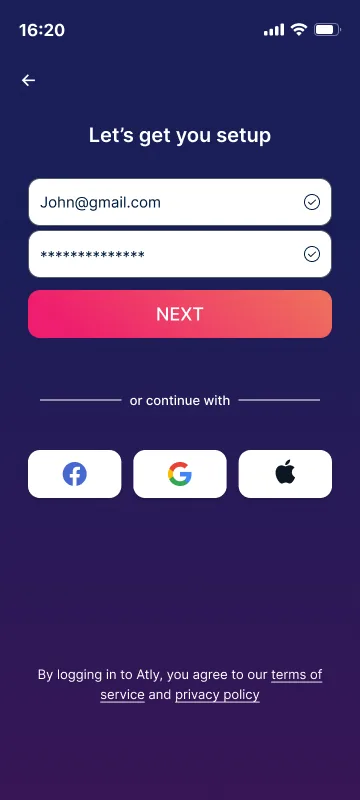
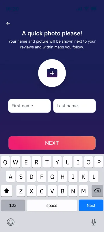
A purchase is met with a celebration, welcome to your new life, before a short setup: email or one-tap sign-in with Facebook, Google or Apple, then a name and photo, with the reason spelled out. They appear next to your reviews and in the maps you follow.
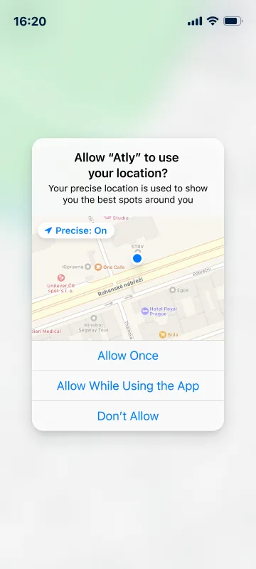
The location request arrives last and explains itself in the same terms as the product: your precise location is used to show you the best spots around you. By then the user has already seen what those spots look like.

Teach the search by using it
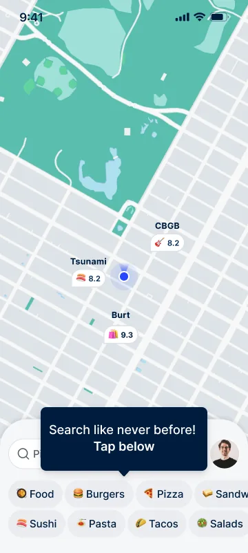
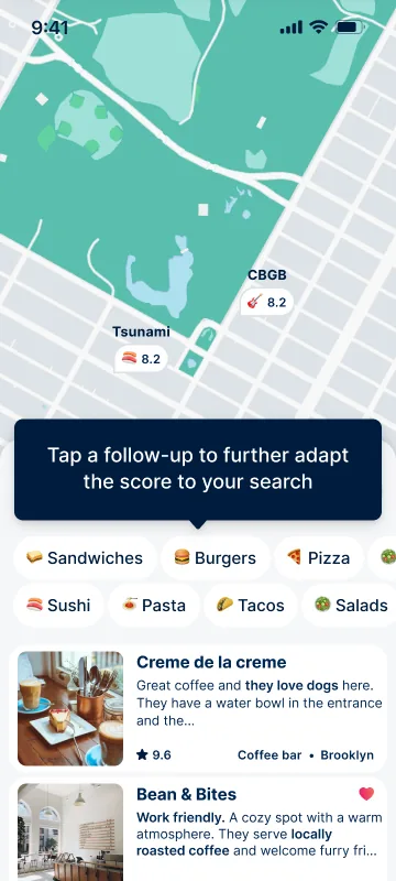
The tutorial runs on the live map, not on slides. Three prompts, one at a time: search like never before, tap below. Place scores update as you narrow down your search. Tap a follow-up to adapt the score further.
Each prompt points at the control it describes, so the first real search is also the last step of the onboarding. The user leaves the flow already doing the thing the ad promised.

Carry the promise through
A paywall is judged by conversion, but the second lift came from outside it: the ad, the onboarding and the paywall told one story, starting from the user’s own interest and widening from there. The same principle as the match score, applied to the business.
Show, then ask
Every request in the flow, money, an account, a photo, a location, comes after the user has seen what it buys them. The order is the argument.