Landco Holdings
Design Study
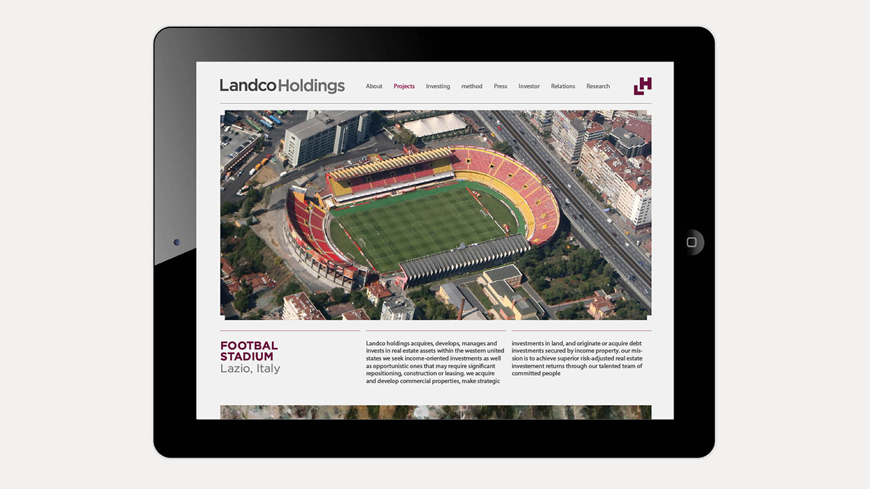
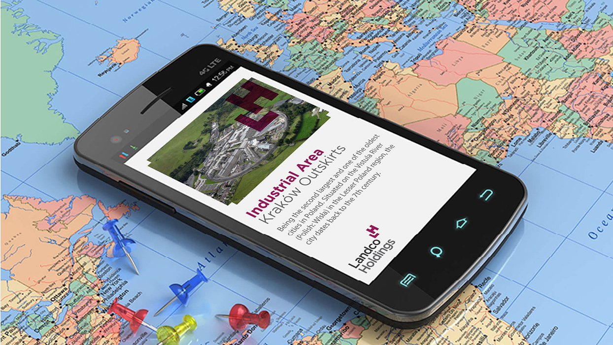
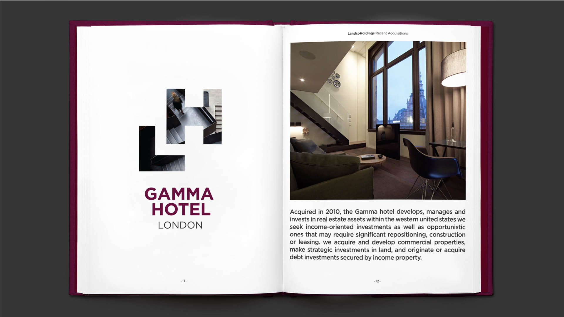
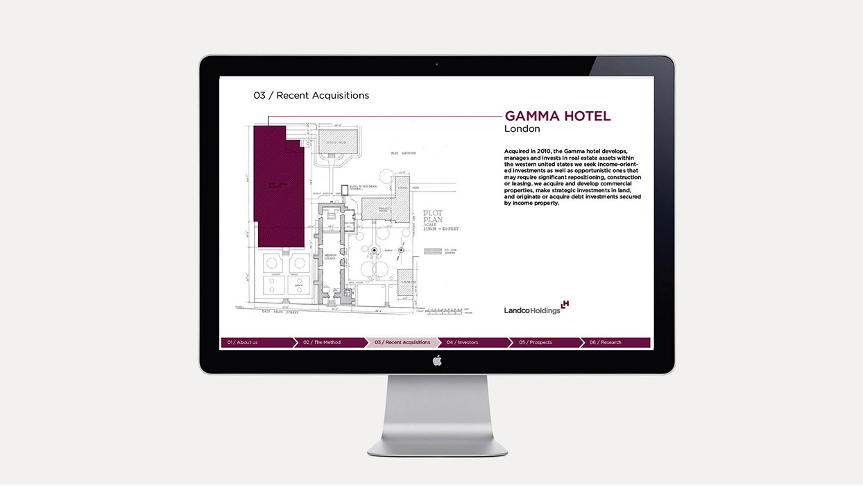
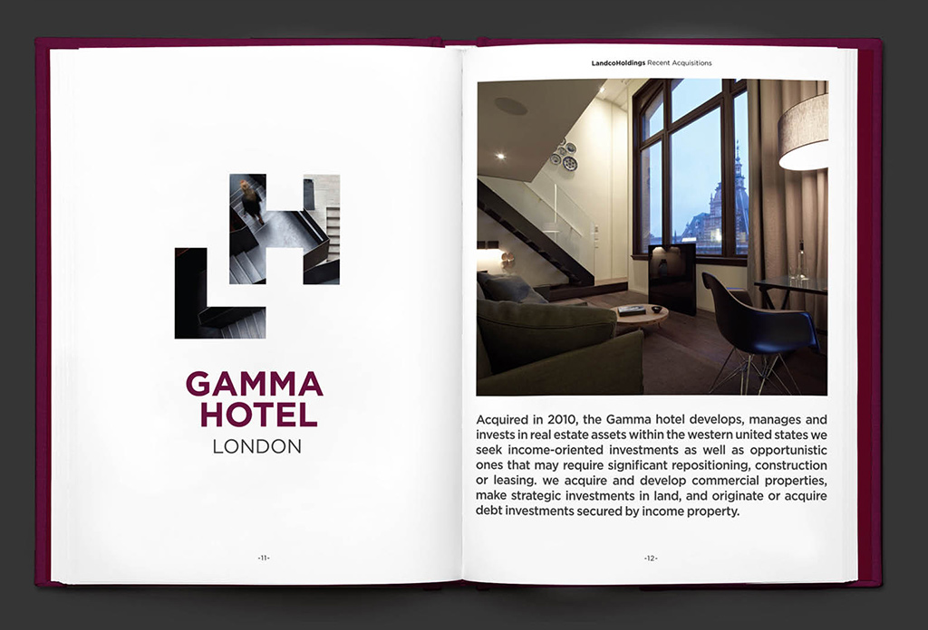
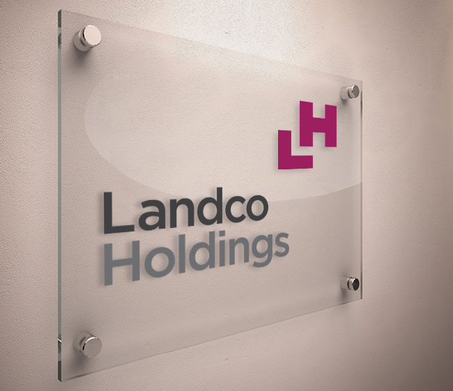
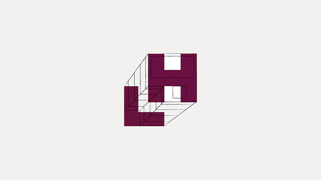
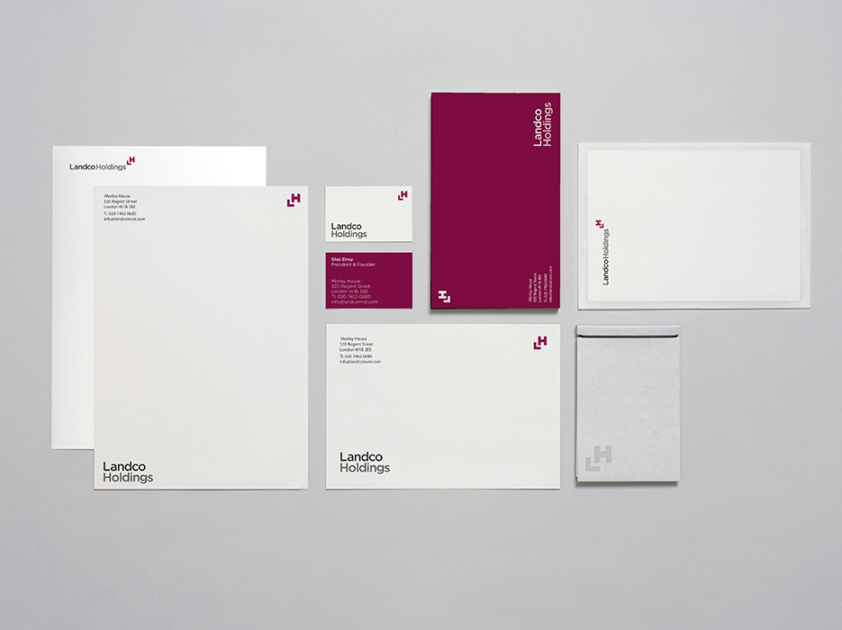
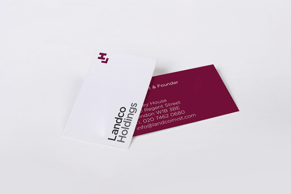
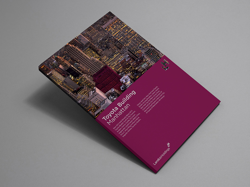
Landco Holdings is a real estate management company whose portfolio encompasses properties requiring both clear identification in the field and navigational legibility on printed maps. The studio was engaged to design the LH logotype, a mark conceived not merely as a corporate signature but as a functional cartographic instrument. The letterforms were structured such that when the mark is applied to maps or affixed to buildings under the company's management, it operates as a directional indicator, pointing toward the relevant property. This integration of brand identity and wayfinding collapsed the distinction between mark and operational tool, producing a logotype that justifies its own form through use. Rather than designing a logo that communicates the brand's activities abstractly, the studio designed one that performs them directly.
Commissioned by Roof.